How do I Create a Resource Stack Chart?
Resource stack charts are helpful for quickly visualizing the capacity stack of a zone and where the dispatch costs change as you move up the stack.
Start by making sure you have the ResourceStack Year output table.
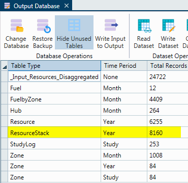
Next, make sure the table is sorted by Zone, then by Capacity_Stack (increasing).
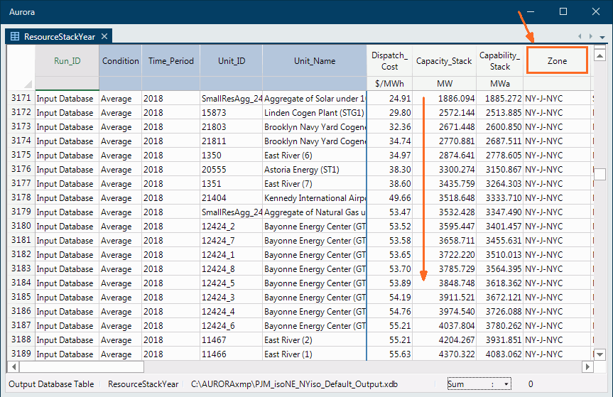
Then click the Chart button.

Next, setup the charting window like this:
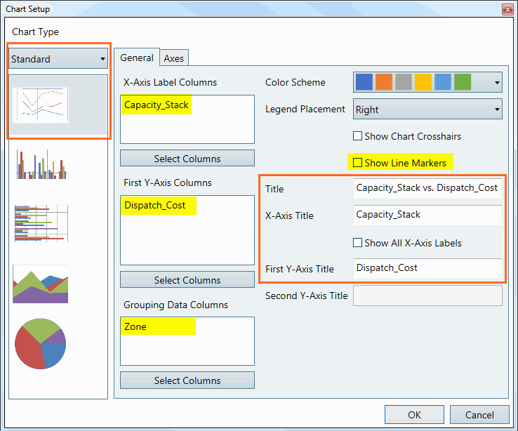
You'll end up with something like this:
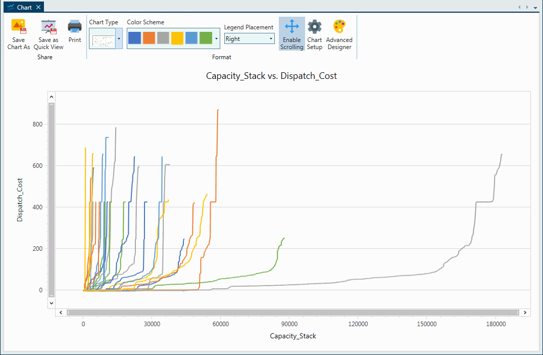
To clean it up a littler further, select the Advanced Designer button from the toolbar, then click the Change Chart Type button near the top left part of the form.
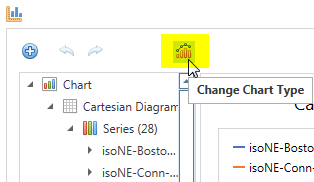
![]() NOTE: A warning box may appear to let you know that the dataset is large and not all data will appear in the Advanced Designer. Select Yes to continue.
NOTE: A warning box may appear to let you know that the dataset is large and not all data will appear in the Advanced Designer. Select Yes to continue.
In the new window scroll down to Line Series chart types and select the Step Line 2D option, or type "Step" into the search bar to reduce scrolling.
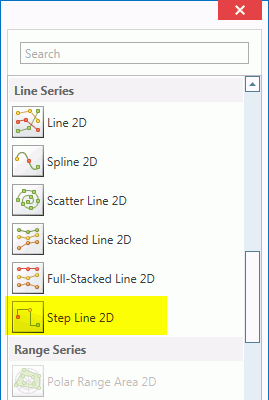
Finally, go to full screen, if not already, for better viewing and you'll end up with a chart like this:
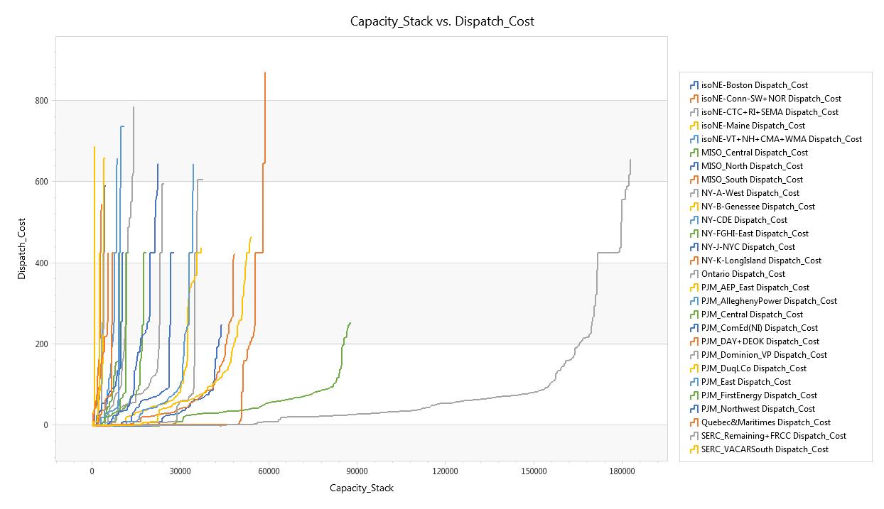
![]() Resource Stack Chart
Resource Stack Chart
