Resource Stack Chart
Q: How do I Create a Resource Stack Chart?
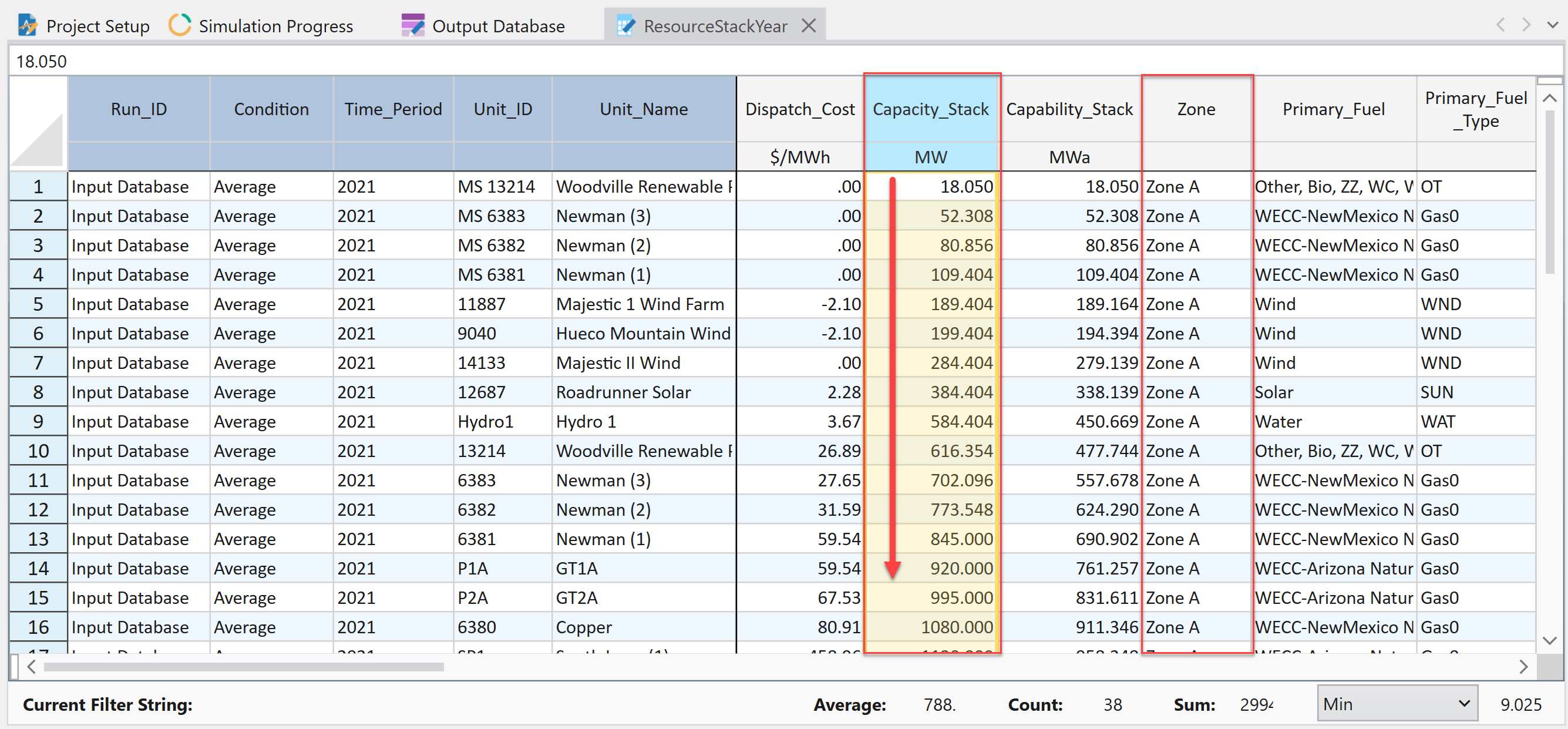
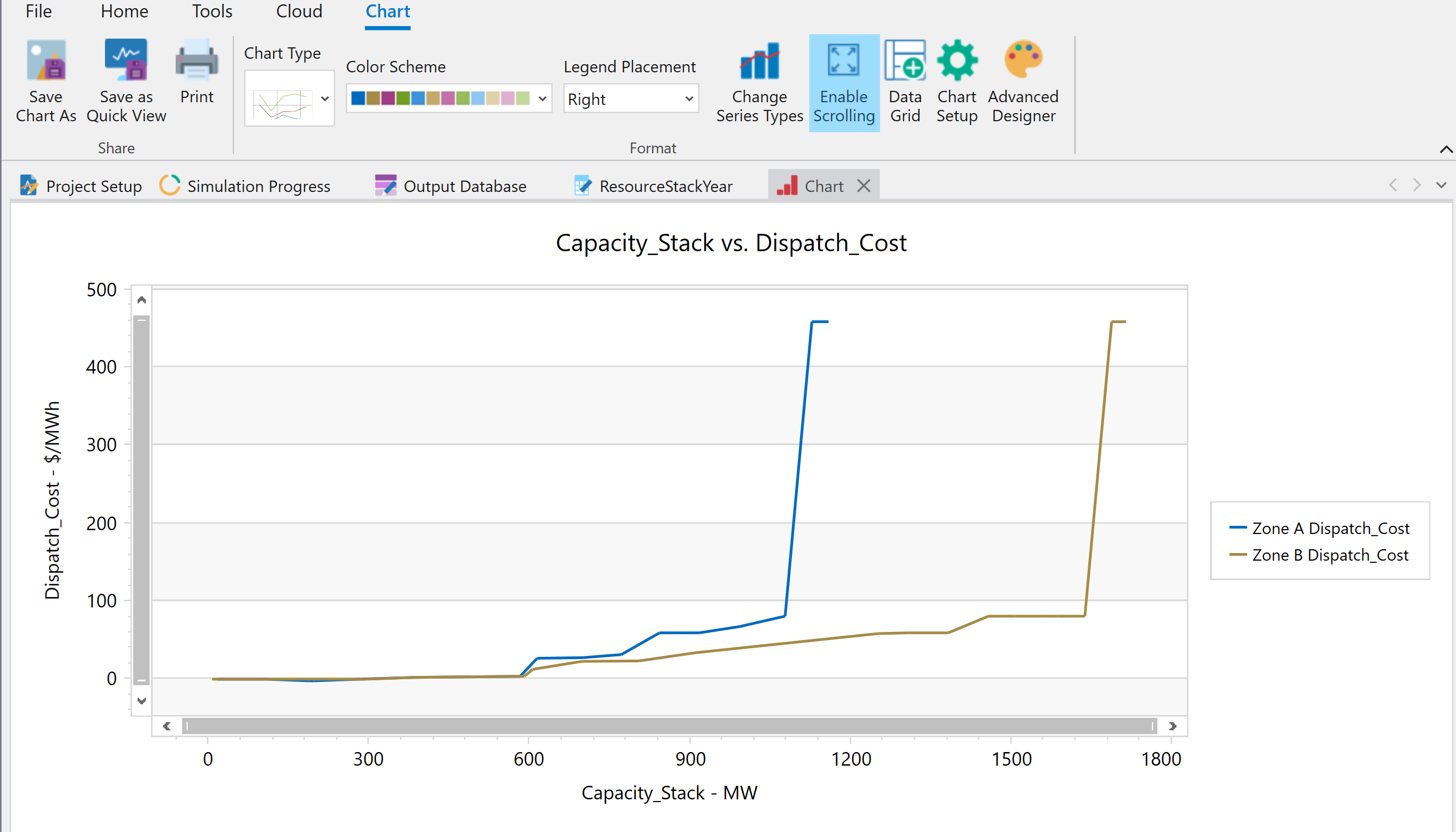
Resource stack charts are helpful for quickly visualizing the capacity stack of a zone and where the dispatch costs change as you move up the stack.
- Start by making sure you have the ResourceStack Year output table.
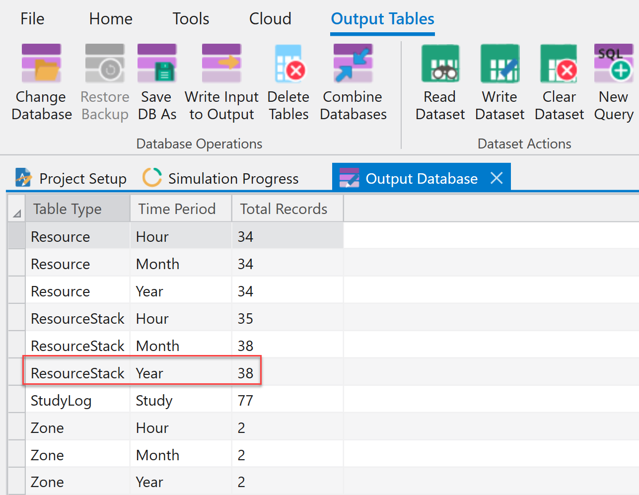
- Next, make sure the table is sorted by Zone, then by Capacity_Stack (ascending).
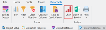
- Click the Chart button.
- Set up the chart X and Y-Axis and enter Titles as shown.
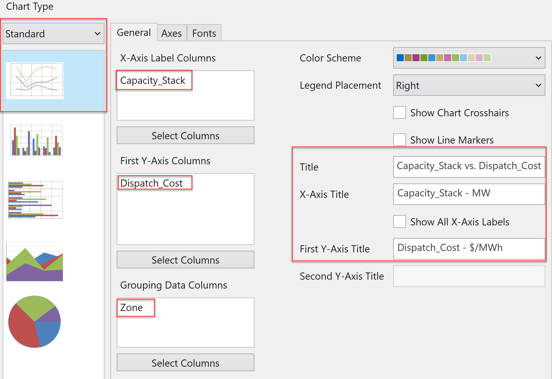
- Make sure to deselect the box for "Show Line Markers" and then click OK. You'll end up with something like this:
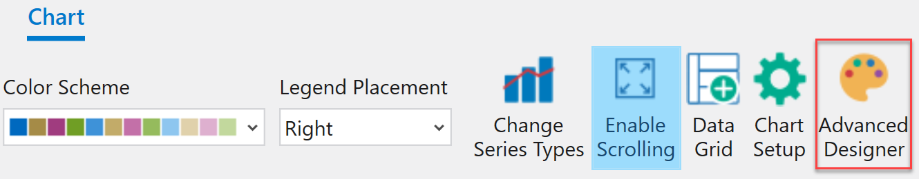
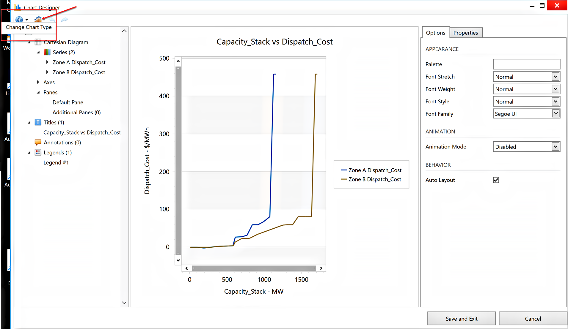
- Select the Advanced Designer button from the toolbar.
![]() NOTE: A warning box may appear to let you know that the dataset is large and not all data will appear in the Advanced Designer. Select Yes to continue.
NOTE: A warning box may appear to let you know that the dataset is large and not all data will appear in the Advanced Designer. Select Yes to continue.
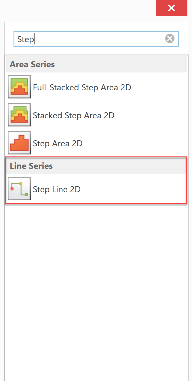
- Click the Change Chart Type button near the top left part of the form.
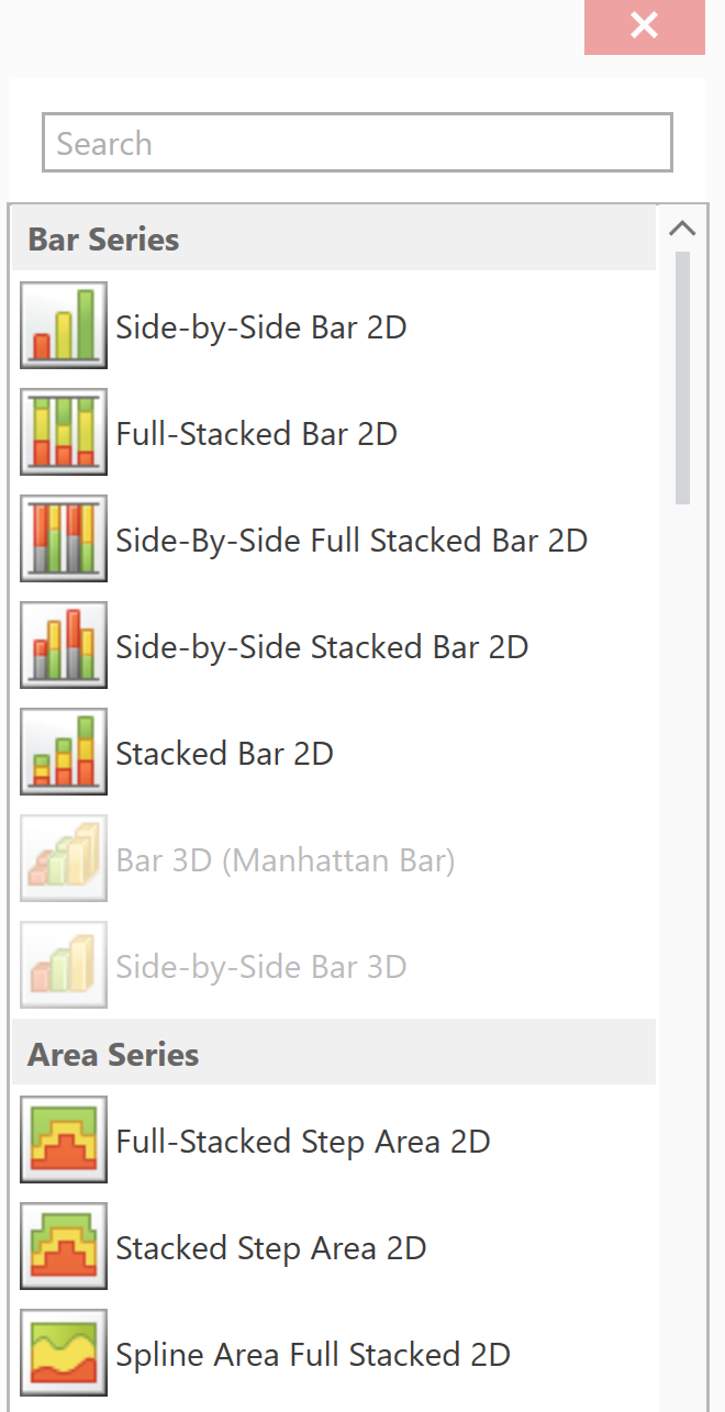
- In the new window scroll down to Line Series chart types by typing Step in the search bar and select the Step Line 2D option.
- When you are finished, click Save and Exit. Go to full screen for better viewing.
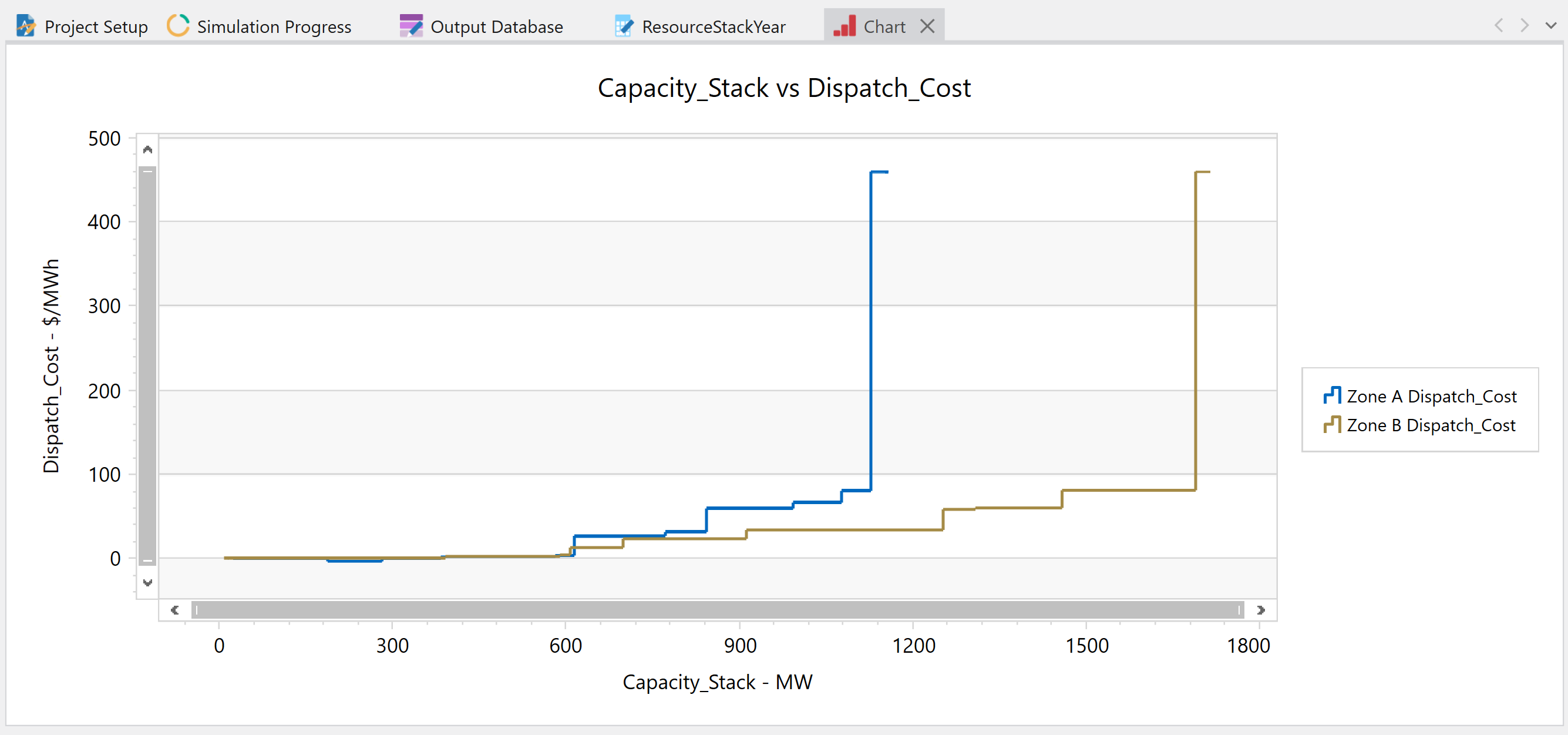
![]() Resource Stack Chart
Resource Stack Chart