Bus Diagram 
![]() NOTE: This feature is only available for nodal studies with loaded Network Case Input Files. Large systems may take a longer time to load on an initial launch.
NOTE: This feature is only available for nodal studies with loaded Network Case Input Files. Large systems may take a longer time to load on an initial launch.
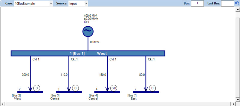
The Bus Diagram provides a graphical representation of the nodal system being modeled.
The Bus Diagram window has several settings to select data:
|
Bus Diagram Toolbar 
When Source = Output, the following additional options are available:
|
|
|
Toolbar
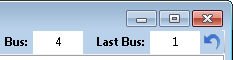
Use these setting to select a bus for viewing. Type a valid bus number in the Bus field and hit Enter. As you click-thru buses, the Last Bus field will show the bus number for the last bus. Use the refresh arrow on the right to return to the Last Bus. |
Bus Information
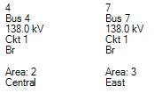
This part of the diagram shows the Bus_Descriptor, including bus number, bus name, and kV rating for the bus. It also shows the assigned Loadflow Area. The bus is outlined in a color that corresponds to the bus kV. This Marginal Cost appears just above the bus on the left when viewing Memory or Output data. |
|
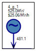
Generators
Generators are located on top of the bus and show:
|
Demand
Demand is located at the far right of the bus and shows:
|
|
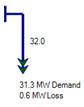
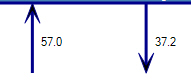
Flow
The arrows below the bus show the flows on the branch. The arrows point in the direction of the flow and the value to the right of the arrow is MW. Values to the left of the arrow are input limits in MW. The arrow is colored to correspond to the bus kV. Colors are determined as follows 601+kV Maroon 401-600kV Red 301-400kV Purple 201-300kV Orange 121-200kV DarkBlue 81-120kV LightBlue 41-80kV ForestGreen All others Black
|
Connecting Bus Information
The text below the arrows gives all the information about the connecting bus, including bus number, bus name, kV rating, circuit ID, shows whether the connection is a branch (Br), transformer (TX), or DC line (DC) and the LFArea number and name. Connecting transmission stations may also be represented as connected with gray transfer lines. Double-click on the text to move to that bus.
These symbols may be located at the connecting buses. They are interpreted as:
|


![]() Productivity Tools
Productivity Tools
![]() Bus Diagram
Bus Diagram