PLEXOS User Interface Guide Chapter 12
Contents
- Introduction
- Execute to CSV
- View LDC Block Data
- Log File
- Phases, Period Types and the Property List
- Numeric Format
- Data Views
- Aggregate query
- Custom Expressions
- Alternate Object Names
- Limiting Objects in a Result
- Apply a Criterion
- Excel
- Clipboard
- Disabling KeyTips for the ribbon buttons
- Charting
- Present Values Calculation
- Zooming
- Quick Charts
- Periods Total
- Colour Picker
- Trends
- Second y-axis
- Retaining Query Results
- Refresh Solution Values
- Repeating Previous Queries
- Saving a Solution View
- Machine Learning Grid
- Solution Comparison
1. Introduction
Model solution files are named "Model <ModelName> Solution.zip" and Project solution databases are named "Project <ProjectName> Solution.zip". PLEXOS can open these solution files directly. The GUI provides a convenient and powerful way to query, chart and export the solution data as well as reviewing the simulation log file.
Note: Only properties selected in the Report screen prior to executing the model are available in the solution database.
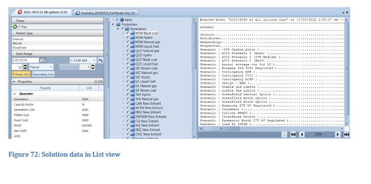
When a solution file is opened in GUI it is presented in the 'Solution Window' as shown in the following picture.
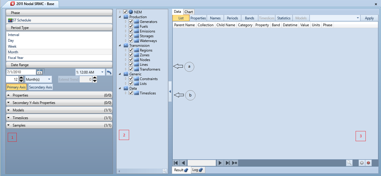
The solution window consists of three areas:
- parameter Panel
- Object tree panel
- Result Panel
There will be a small left arrow button type of control (2) in between the left hand side panel (Parameter and object tree) and right hand side panel (result). Clicking this, will "ping" the parameters and objects to the left. The arrow would then remain available but with a right arrow icon. It can then be "ping'd" to the right to show all three panels again. Hovering over this arrow button will show a tool tip text to "Show Parameters" and "Hide Parameters".
The result panel items are dock able. By default, the data panel is docked on the top and the chart is docked on the bottom. To change this, click on the panel and drag it. There are 3 docking modes. When you drag the panel onto the centre or tab docking hint, the panel will dock in tabbed mode. Tabbed is exactly as shown in the above screenshot, each panel will be shown in a tabbed document style. When you drag the panel on a side docking hint (left, right, top or bottom), the document will dock in group mode. If a document is dropped with no dock hint selected, the panel will be in floating mode hosted in its own window with a task bar item. The dock layout is saved with the query history, so when the query is re executed from this menu, the layout is restored.
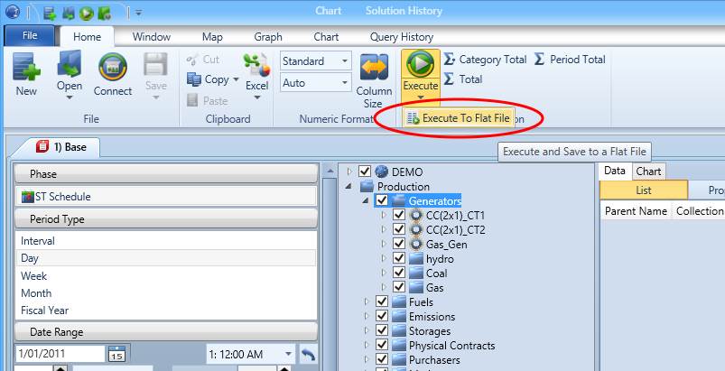
2. Execute to CSV
To save time and perhaps avoid an unnecessary step, Execute to Flat File populates a new file (by default, a new comma separated values (.csv) file) with the data queried by the user, without populating the data grid pane. It can be accessed from the Solution section of the Home ribbon. If the execution to Flat File is successful, a window will open saying the query was successful and it will list the location of the new file, this popup window can be set to never show.
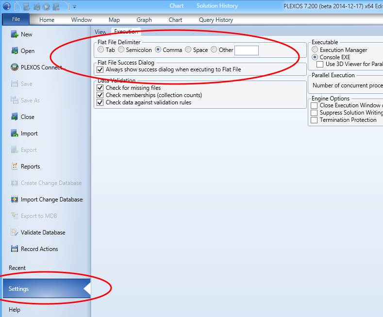
From the execution tab in the settings window, you can adjust:
- The delimiting symbol using during saving
- Whether or not to display the successful execution to flat file pop up window.
3. View LDC Block Data
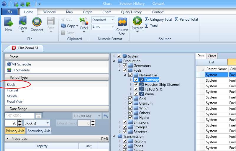
Selecting the period 'Block' and executing the query will populate the data grid with a condensed amount of information when compared to the normal execute operation. It works by showing one interval result per block instead of all intervals available. Since no specific interval is guaranteed to be shown, no date/time data will be displayed and instead the Block ID and Block Length will be displayed. The Block Length is calculated based on the total number of intervals in each block multiplied by the difference in time between two intervals. Note, this option is not available with ST phase selected, only MT, LT or PASA. The start date and time offset will be disabled when the period type 'Block' is selected, this is due to no reliable date/time information being available when getting the query results.
4. Log File
The Log tab for the Solution Viewer allows you to read the log file for the execution. Individual log files can also be loaded by dragging them onto PLEXOS, or through the Open dialog.
On the left hand side is a document outline allowing you to navigate directly to various noteworthy sections of the file. Below the file are some navigation buttons allowing you to page through the file, and some controls allowing you to navigate to Step Start and Complete lines.
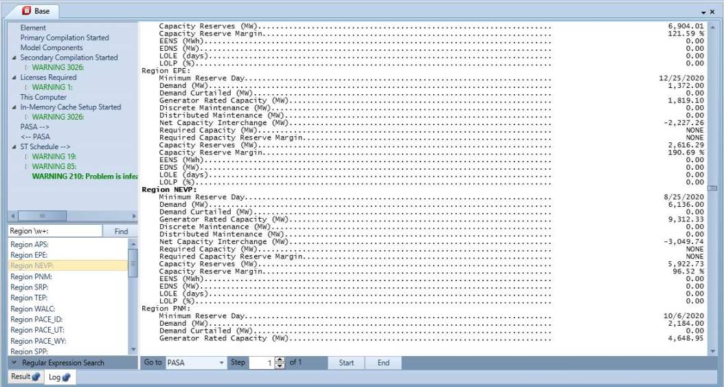
To the lower left, under the document outline, is a search facility allowing for regular expressions, This will list all of the results for the search, allowing you to navigate directly to each result.
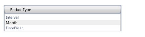
5. Phases, Period Types and the Property List
When you open a solution database, PLEXOS scans the file to see which period types of data are written into the file: the Period Type selector then shows only the available types as in this example. Refer to Reporting for details of how to select period type for reporting.
Summary data (day, week, month, year) are available in the solution database if these data were selected in the Report screen. Summary data are usually in thousands of units, e.g. GWh rather than MW. Most views show the Units column or the Unit in the column heading (properties view).
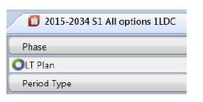
Simulations are usually composed of more than one simulation phase (algorithm such as ST Schedule). The list of phase solution stored in the solution files are listed in the phase selector:
As shown below, the list of properties that are available are shown when you select a collection.
Selecting a different period type changes the list of available properties. The list of available properties shows the collection name, property name, and units for each datum. Most properties belong to System collections, e.g. Generator [Generation]. Some models will have second-level properties, e.g. in Generator [Fuels], [Cost] is the cost of the fuel used for each fuel by each generator.
You can select any property or group of properties (using the CTRL key + mouse click).
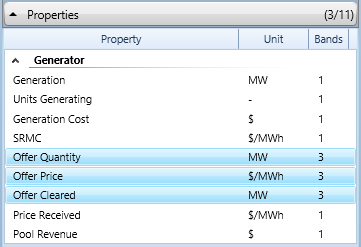
In the property list, after the property name and units is the bands count. This will tell you how many bands are available for each property.
Click the query execute command to see the data:

Shown in below are data in the default List View. In list View there is a single column of values, the other columns show the collection and (optional) category for the objects associated with the data.
There are several alternate grid layouts available in the Solution Data tab view:

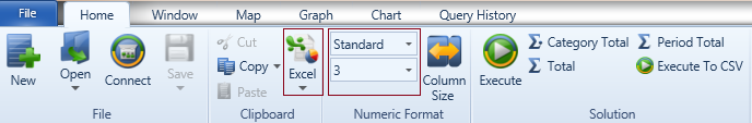
6. Numeric Format
Use the Numeric Format ribbon commands to apply a different number format to the query results. The default is "Standard" which is based on the scheme of the same name in the Windows Regional Settings.
Column Size: Column Resize button

in the ribbon can be used to resized all selected columns.
7. Data Views
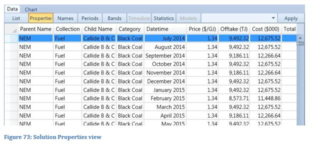
In Properties View, the property names are shown in columns. The unit for the data is also shown in the column titles.
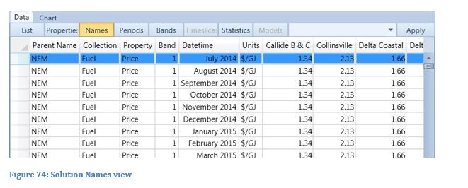
In Names View, the object names are shown in columns. The property names are shown in the rows.
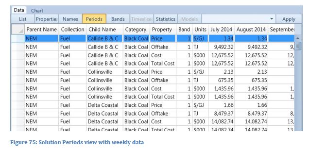
In Periods View, the periods are shown in the columns, the object names and properties are shown in the rows. The columns are labelled according to the type of data being shown:
- Annual data shows the year ending.
- Monthly data shows the month and year.
- Weekly data shows the date the weekends.
- Daily data shows the date.
- Period data shows the date at the start of each day and the time in other periods.
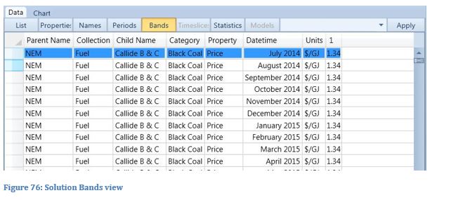
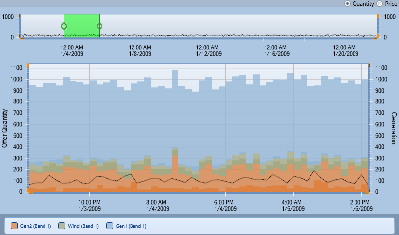
Bands View is used to show multi-band data such as Generator [Offer Quantity], [Offer Price], [Offer Cleared].
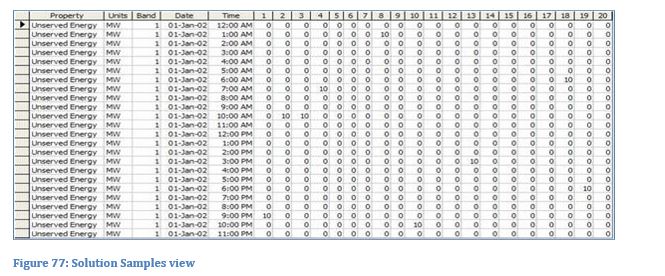
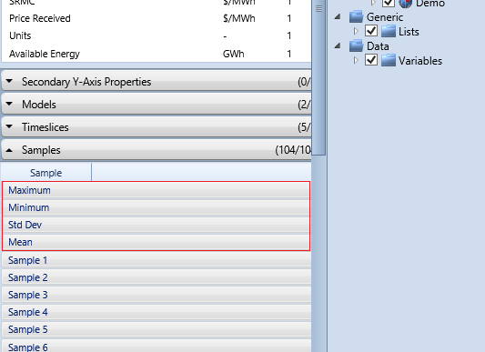
Samples View is only available in solution files that contain the solution to multiple samples (e.g. Monte Carlo draws, or multiple random samples of data: see Reporting). Each sample's result is shown in a column.
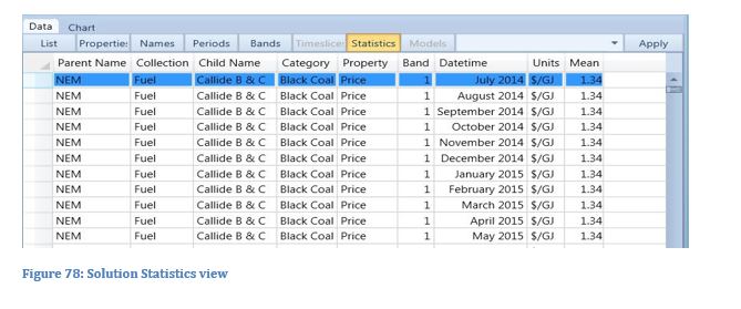
Statistics View is only available where the statistics have been saved. The columns shown are Maximum, Minimum, Std Dev and Mean.
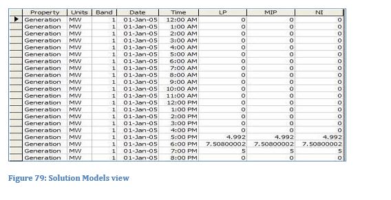
Models View is only available for Project databases (i.e. database containing the solution to multiple Models). Each Model's result is shown in a column.
8. Aggregate Query
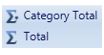
The data in a collection or category can be automatically summarized to totals using the sum commands:
9. Custom Expressions
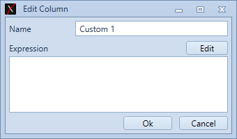
Columns that are calculated via custom expressions can be added to the solution grid. To access this feature
Choosing "Add Custom Column" will open the custom expression editor window:
Clicking "Edit" opens the expression editor window.
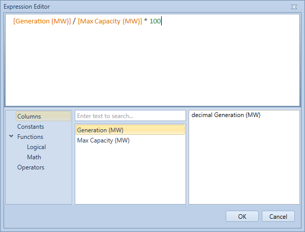
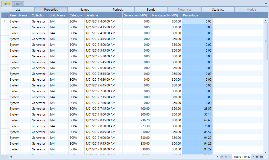
Entering an expressions such as the one shown above will populate the new column with the percentage of the max capacity that a generator is generating during a specific interval, as shown below.
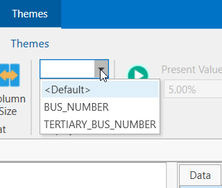
10. Alternate Object Names
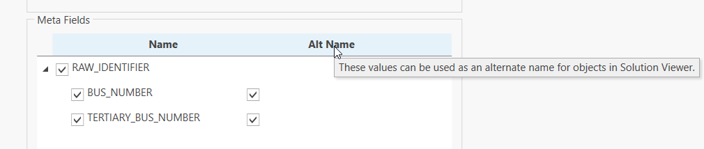
Meta-fields, set in the Input Database, can be marked as available for use as an alternate object name in the Solution Viewer.
When Meta-fields are available for a class in the Solution Viewer, they can be selected from a Ribbon Drop-Down. This will update the Tree View with the values of the Meta-field in place of the original Object names.
Queries executed with an alternate object name selected will add the alternate name as a column to the query result. In the following example, Object names have been replaced with the first few words from a vocabulary list.
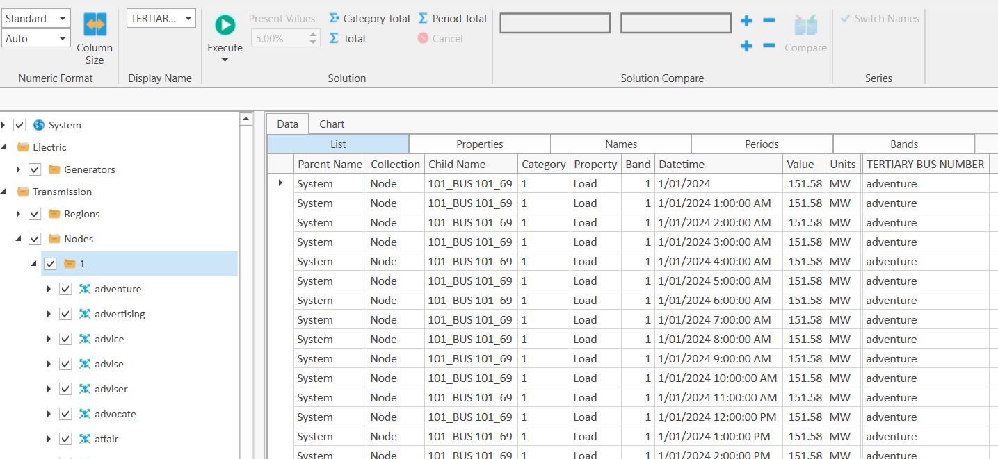
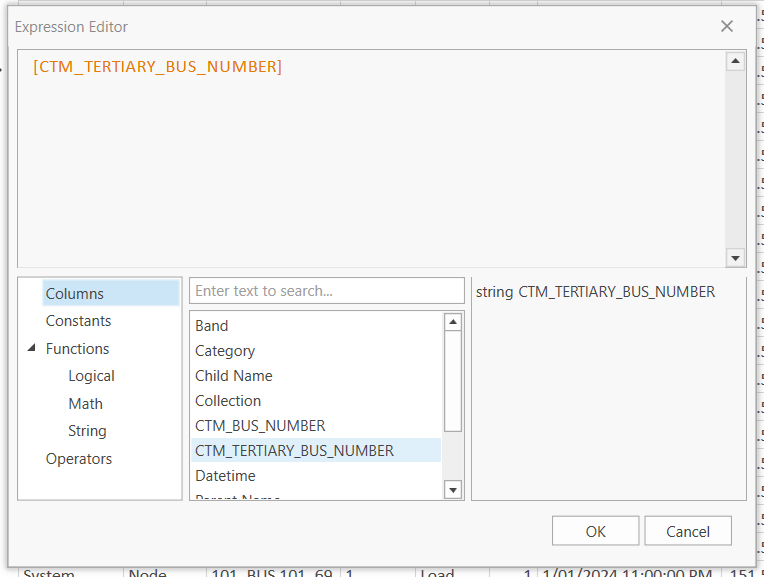
Meta-fields and columns are now available in the Expression Builder, prefixed with CTM_ (for "Custom").
11. Limiting Objects in a Result
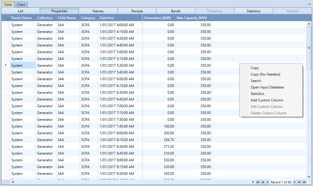
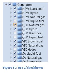
By default, all objects that were selected for reporting appear in any query. You can limit the objects shown in two ways. Firstly by selecting a category of objects in the tree, and secondly by using the check boxes next to each object. The solution tree shows tick marks next to each object, and these can be used to exclude/include objects from the queries. In the example, all generators belonging to the categories "GAS", "OIL" and "URANIUM" will be excluded from the next query result.
12. Apply a Criterion
You may want to see only data that pass some criterion. You can use the dropdown next to the period range selector to accomplish this:
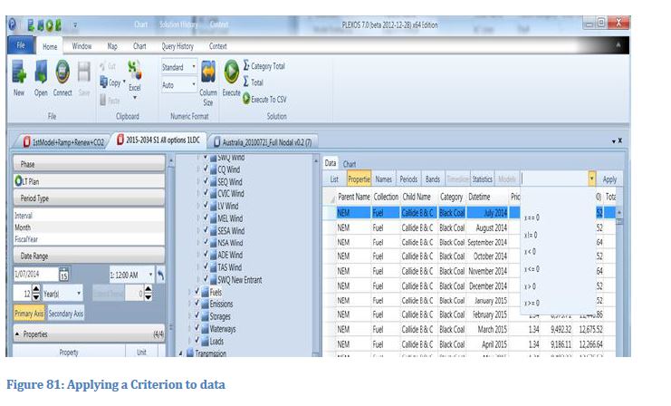
Select one of the criteria from the list and execute your query. Only data passing this criterion are displayed. This criterion is also applied when charting data. It is very useful for limiting the returned records of number of series when querying data that are mostly zero values such as [Unserved Energy].
13. Excel
The Copy to Excel function conveniently copies the current grid selection to Excel.

This button has a dropdown menu of available options:
- Paste the current grid selection to a new Worksheet in a Workbook of your choosing.
- Paste the current grid selection to a block beginning at the current selection the Worksheet of your choosing. (Requires Excel to be currently running.)
- Paste all grid data from each result tab to new Worksheets.
This command supports all versions of Excel from Version 9 through 14.
14. Clipboard
Data can be copied from the data grid to any application using the standard Copy/Paste functions on the toolbar.
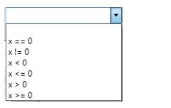
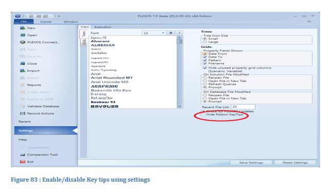
15. Disabling KeyTips for the Ribbon Buttons
Hotkeys for some of the buttons on the ribbon bar can be highlighted by pressing Alt key see image below.
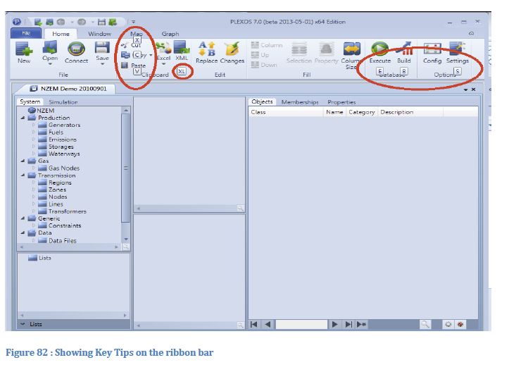
However this behaviour can be disabled from settings window of PLEXOS GUI. In order to hide the keytips, user to check the "Hide Ribbon KeyTips" checkbox, see image below. "Save Settings" button has to be pressed in order to apply changes.
16. Charting
PLEXOS includes advanced charting ability, using an embedded component that utilizes GPU acceleration. Any selected query can be viewed as a chart. PLEXOS reads the queried data and creates data series automatically; e.g. if you select data from the [Regions] collection, one series is created for each Region object and each property. Therefore you can view chart data from any view.
Several Chart Types are Available (from the toolbar):
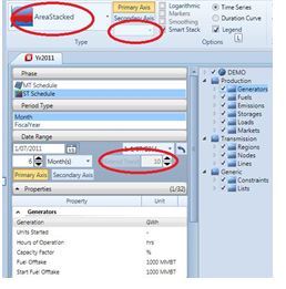
Area Chart: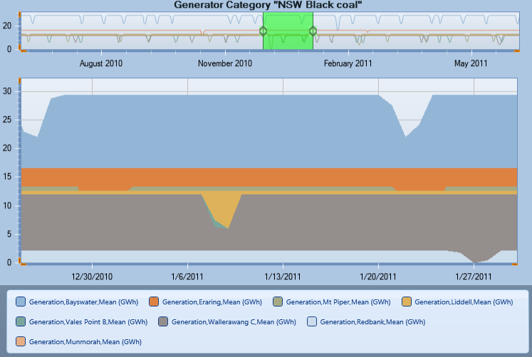
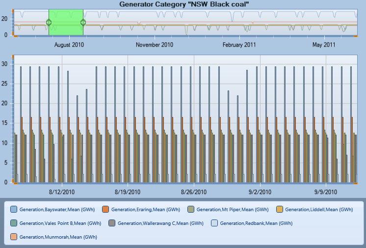
Column Chart:
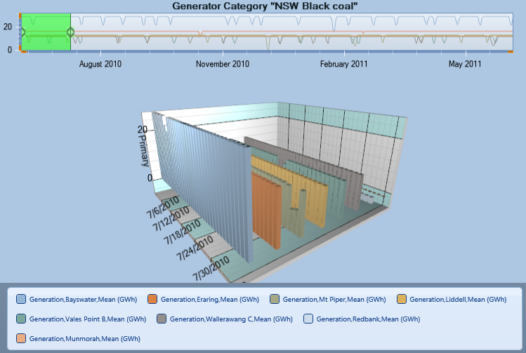
Column 3D Chart:
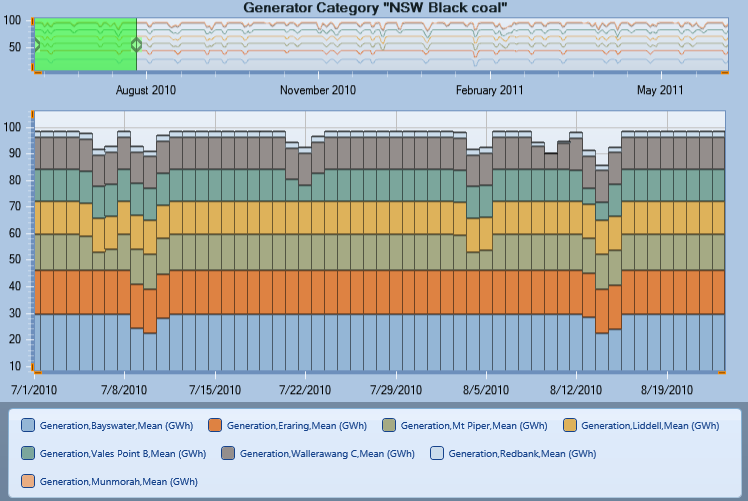
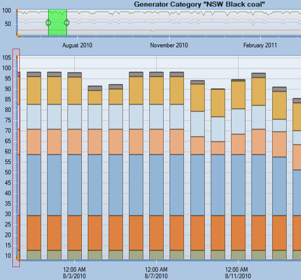
Column Stacked Chart:
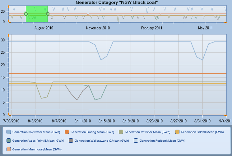
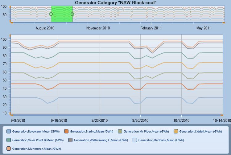
Line Chart: Suitable for viewing capacity and generation data e.g. Region [Available Capacity] or [Generation]
Line Stacked Chart:
Radar Chart:
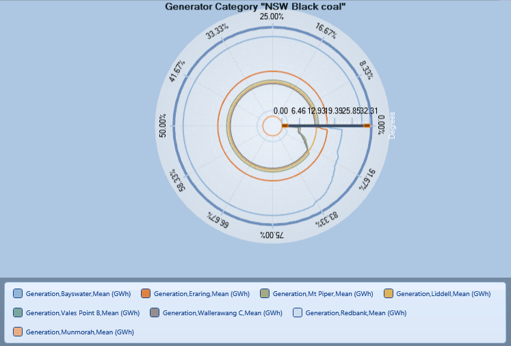
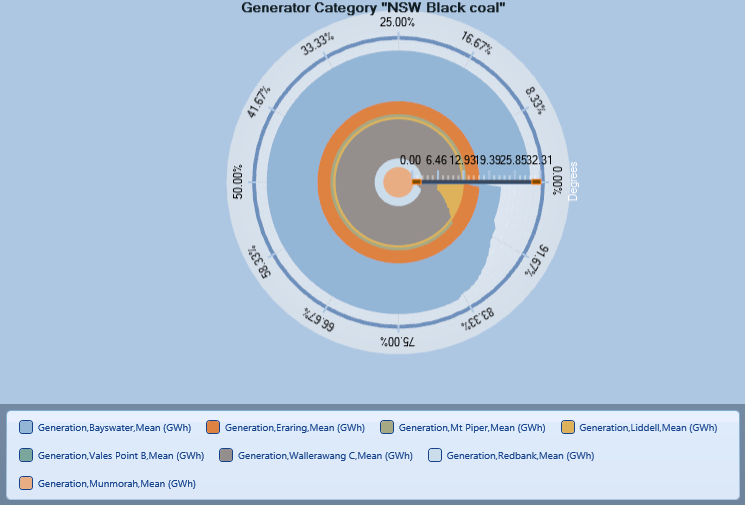
Radar Filled Chart:
Ribbon Chart:
Step Chart:
Step Area Chart:
Smart Stack: Selecting Smart Stack will automatically order the data series so that the series with least variability is displayed first e.g. baseload generation before peaking. Smart stack is applicable for stacked charts only.
Chart Options:
- Logarithmic - Data that are highly volatile, e.g. [Price], is often shown using a logarithmic scale. Tick the Logarithmic check box on either the primary or secondary axis tabs.
- Marker - Tick Marker checkbox to enables/disables points on the given charts if available.
- Show Zero Series - Descaling this option will hide any line series that contains exclusively zero values.
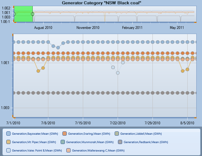
By default the chart shows a time series, but you can select a duration curve. A duration curve shows data in order from highest to lowest and is often used to show price, or transmission line flow data.
Chart Adjustments: Besides dragging on zoom bar and using mouse scrolling, you can now change the time range by dragging on X axis. Similarly you are able to adjust the minimum and maximum Y value on both primary and secondary charts separately. This is done by clicking and dragging on each Y axis. It is also possible to magnify or minify axis units by dragging at each end of Y axis (shown in orange).
17. Present Values Calculation
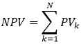
Net Present Value of a stream of Cash Flows:
A cash flow (CF) is an amount of money that is either paid out or received, differentiated by a negative or positive sign at the end of a period. Conventionally, cash flows that are received are denoted with a positive sign (total cash has increased) and cash flows that are paid out are denoted with a negative sign (total cash has decreased). The cash flow for a period represents the net change in money of that period. For a stream of cash flow:
we can get the present value for each period as:
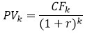
where CFk is the cash flow at k-th period and r is a discount rate.
Calculating the net present value (NPV) of a stream of cash flows consists of discounting each cash flow to the present, using the Present Value Factor and the appropriate number of compounding periods, and combining these values.
There is an ability to calculate present values for any cash flow property (Profit, Cost etc.). The feature is accessed from the main ribbon control (under Home tab). To get present values for selected properties user has to check the corresponding checkbox and use the text box under it to input desired discounting rate.
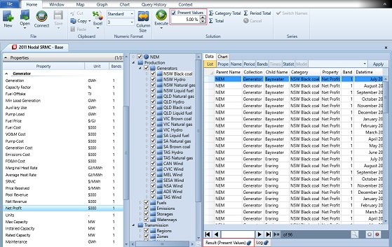
Each results tab holding values calculated as present values has an addition "(Present Values)" to its header. As calculation of present values is meaningful for cash flows only, property filtering is introduced. Only properties with '$' symbol in their unit field and without a '/' symbol (prices have "$/smth" and aren't used for PV calculations) are processed, all other data is ignored. Present values calculation only applies to regular chart and does not apply to special charts. A Present Value calculation does not apply for Interval data.
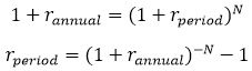
Note that the discount rate set through the text box is an annual rate. This value will be converted into a corresponding rate matching the selected period type used in query. The result rate is the rate that yields the annual rate when it is compounded for N periods:
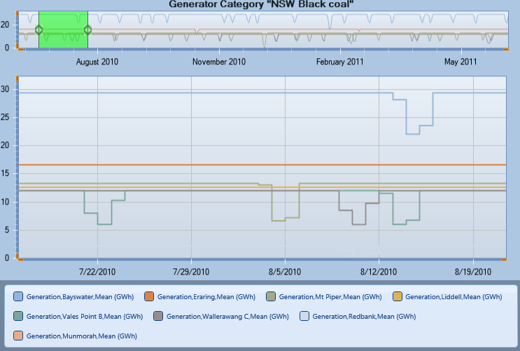
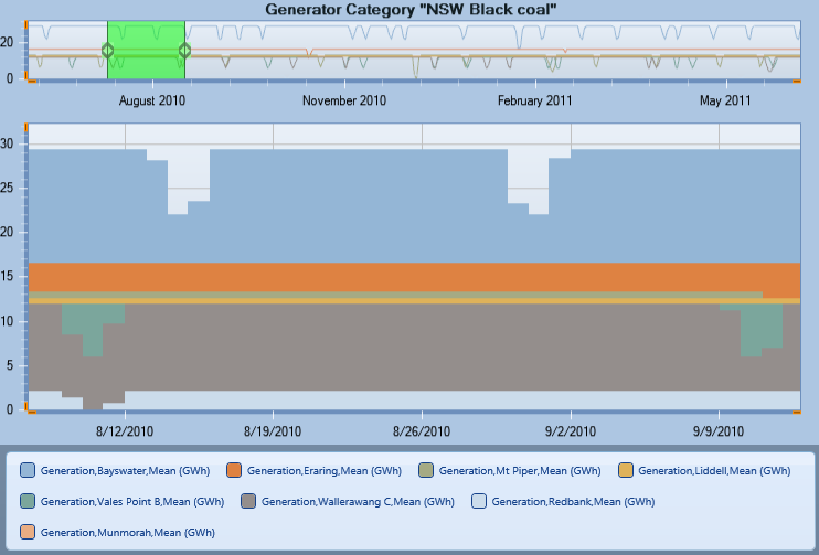
18. Zooming

Using Reset button from the ribbon menu, dragging over the chart causes the query to zoom-in. You can continue zooming in, or reset the data range using the Reset toolbar command. Note that, after you have zoomed in, the date range is set to match so any subsequent queries show the same data range.
19. Quick Charts
19.1. Supply/Demand Balance Chart

Creates a chart showing the balance of supply and demand for the selected Region or Node or Zone.
19.2. Bid Stack Chart

Creates a chart showing the quantity mode and price mode for the generators with properties generation, offer price and offer quantity.
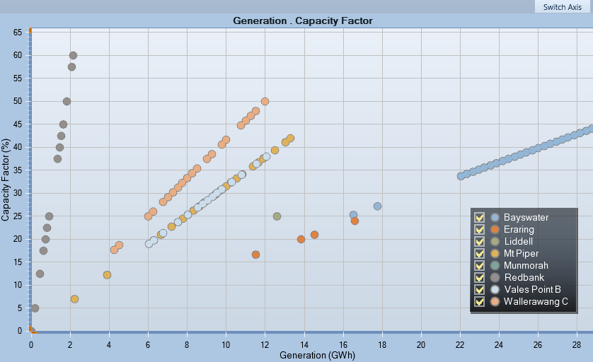
19.3. XY Chart

Creates a chart showing the mapping relationship between two properties.
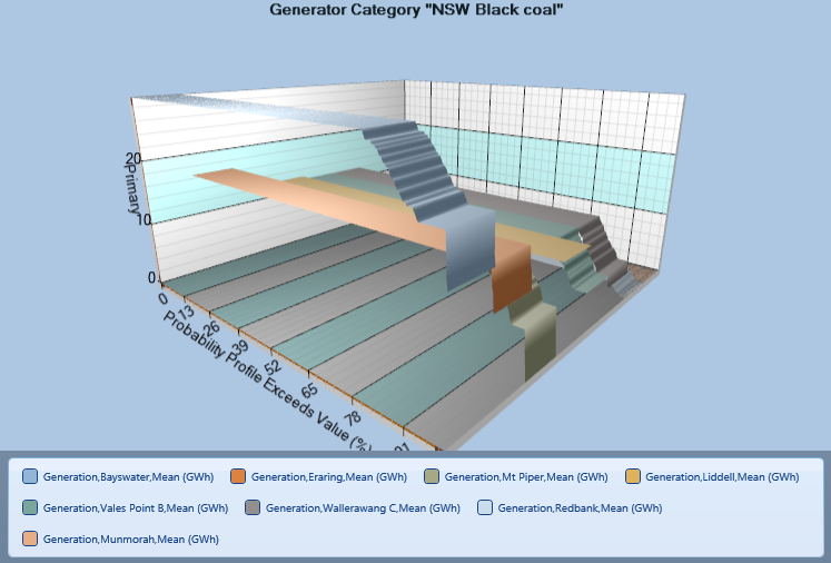
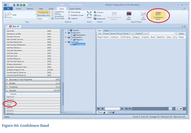
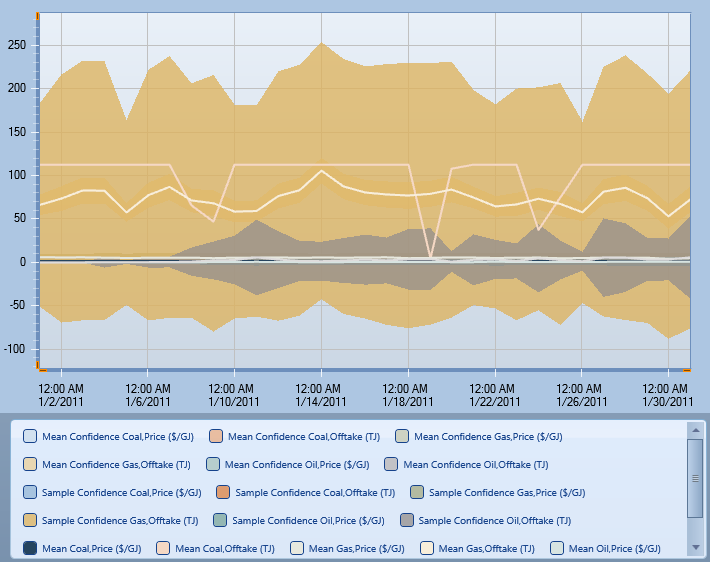
19.4. Confidence Bands
A Confidence Band chart indicates the reliability of the estimate. It is accessed from Chart ribbon menu, Quick Charts section. In order to call this chart, the solution has to be built using simulations and also include mean values and Standard Deviations. The user has to select objects, properties, time slices and phases. All of which will be used to build confidence bands (in the image below, confidence bands are built on the generation of three generators.
There are two types of confidence bands:
- Sample confidence band: The area where there is a 95% probability of the actual sample occurring (it is defined by population mean and standard deviation)
- Mean Confidence Band: The area where there is a 95% probability of the population mean occurring (depends on the number of samples: the more simulations executed, the narrower this band is)
19.5. Gantt Chart

Creates a Gantt chart showing the Hours Active for each Maintenance object.
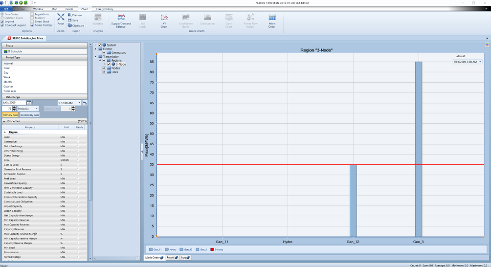
19.6. Merit Order Chart
Creates a chart showing the SRMC of all the generators and the price in selected node, zone or region in the specified period. The generators will be displayed on the X-axis, ranging from the cheapest to the most expensive (SRMC) and the price on Y-axis. The horizontal red line will indicate the price in the selected node, zone or region for the selected period. By default, the first available period will be displayed. Users can select the period from the dropdown list at top right corner.
19.7. Probability Distribution Chart
The probability distribution charts are used to check if multi-sampling solution data fits to any known distribution from the predefined collection.
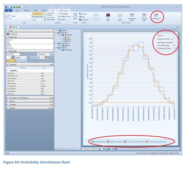
In order to open the chart, user has to select objects and then a property to be tested. The selected property has to have multiple samples reported. Known distribution is selected from the corresponding combo box in the upper-right corner of the chart. The user can also select the number of columns (bands) of the histogram, set time window of the selection (either first time stamp or the whole range of dates is used) and select if they want to use property values as random variables or errors (value - sample_mean).
19.7.1. Weibull Distribution
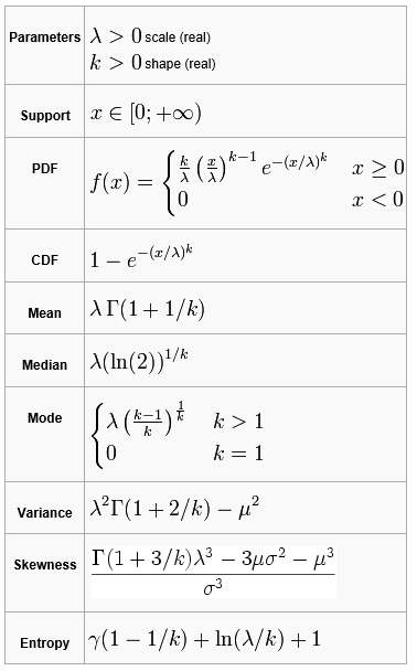
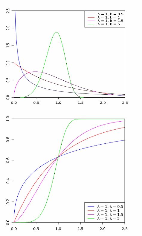
The probability density function of Weibull random variable x is:
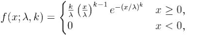
where k > 0 is the shape parameter and λ > 0 is the scale parameter of the distribution.
Its complementary cumulative distribution function is a stretched exponential function.
The Weibull distribution is related to a number of other probability distributions; in particular, it interpolates between the exponential distribution (k = 1) and the Rayleigh distribution (k = 2).
If the quantity x is a "time-to-failure", the Weibull distribution gives a distribution for which the failure rate is proportional to a power of time. The shape parameter k, is that power plus one and so this parameter can be interpreted directly as follows:
A value of k<1 indicates that the failure rate decreases over time. This happens if there is significant "infant mortality", or defective items failing early and the failure rate decreasing over time as the defective items are weeded out of the population.
A value of k=1 indicates that the failure rate is constant over time. This might suggest random external events are causing mortality, or failure.
A value of k>1 indicates that the failure rate increases with time. This happens if there is an "aging" process or parts that are more likely to fail as time goes on.
In the field of materials science, the shape parameter k of a distribution of strengths is known as the Weibull modulus.
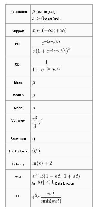
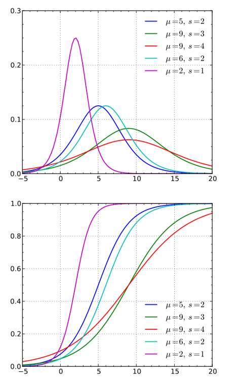
19.7.2. Normal Distribution
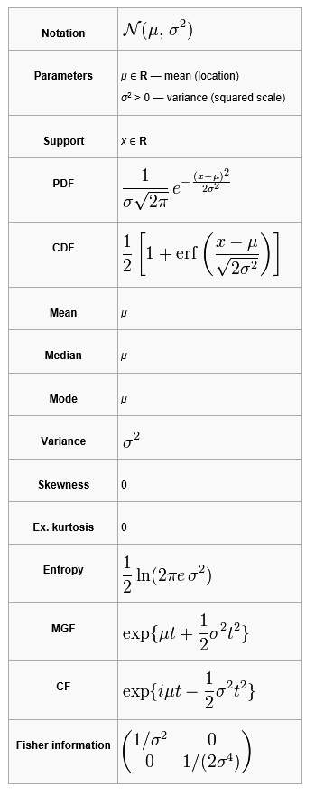
The Normal Distribution or Gaussian Distribution or more informally the bell curve is a continuous probability density function defined on the entire real line.
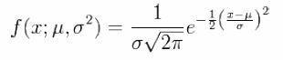
The parameter μ is the mean or expectation (location of the peak) and σ2 is the variance. σ is known as the standard deviation. The distribution with μ = 0 and σ2 = 1 is called the standard normal distribution or the unit normal distribution. A normal distribution is often used as a first approximation to describe real-valued random variables that cluster around a single mean value.
19.7.3. Log-normal Distribution
A log-normal distribution is a continuous probability distribution of a random variable whose logarithm is normally distributed. If X is a random variable with a normal distribution, then Y = exp(X) has a log-normal distribution; likewise, if Y is log-normally distributed, then X = log(Y) has a normal distribution. The log-normal distribution is the distribution of a random variable that takes only positive real values. The distribution is occasionally referred to as the Galton distribution or Galton's distribution, after Francis Galton. The log-normal or lognormal' distribution also has been associated with other names, such as McAlister, Gibrat and Cobb-Douglas.

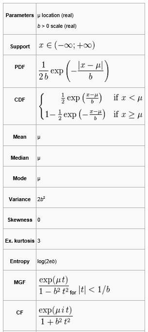
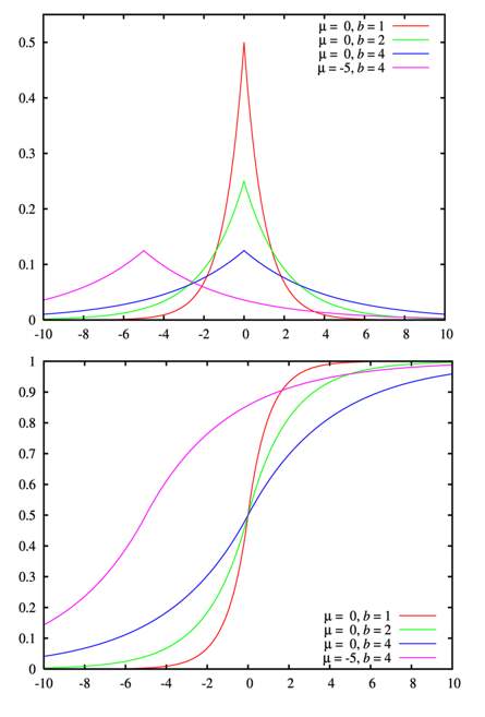
19.7.4. Laplace Distribution
The Laplace distribution is a continuous probability distribution named after Pierre-Simon Laplace. It is also sometimes called the double exponential distribution, because it can be thought of as two exponential distributions (with an additional location parameter) spliced together back-to-back, but the term double exponential distribution is also sometimes used to refer to the Gumbel distribution. The difference between two independent identically distributed exponential random variables is governed by a Laplace distribution, as is a Brownian motion evaluated at an exponentially distributed random time. Increments of Laplace motion or a variance gamma process evaluated over the time scale also have a Laplace distribution.
19.7.5. Logistic Distribution
The logistic distribution is a continuous probability distribution. Its cumulative distribution function is the logistic function, which appears in logistic regression and feed forward neural networks. It resembles the normal distribution in shape but has heavier tails (higher kurtosis).
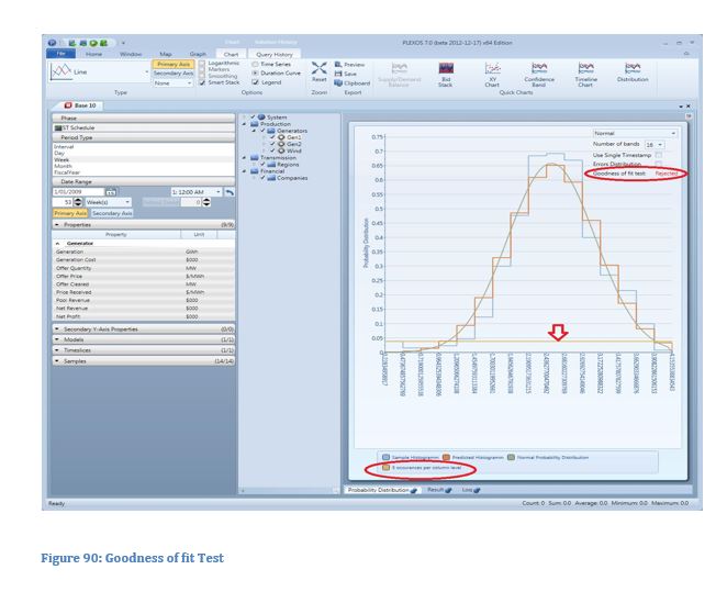
19.7.6. Goodness of Fit Tests
In order to test goodness of fit either the G-test is used, when all the selected categories (histogram columns) have at least one occurrence or the Pearson's test is used otherwise. Generally the more columns (categories) used, the higher the precision of the fit. However with higher number of categories, there is a greater chance that each single category will get a low number of samples in it. Avoid situations when there are columns with zero frequencies or when a number of columns with frequencies less than 5 (the level is highlighted with the "5 occurrences per column level" line) are more than 20% of all columns, as the power of the tests drops significantly.
Pearson's Chi-squared Test
Pearson's χ2 test tests a null hypothesis stating that the frequency distribution of certain events observed in a sample is consistent with a particular theoretical distribution. The events considered must be mutually exclusive and have total probability of 1. A common case for this is where the events each cover an outcome of a categorical variable. A simple example is the hypothesis that an ordinary six-sided die is "fair", i.e. all six outcomes are equally likely to occur. The value of the test-statistic is
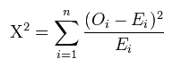
where:
- χ2 = Pearson's cumulative test statistic
- Oi = an observed frequency
- Ei = an expected (theoretical) frequency, asserted by the null hypothesis.
- n = the number of cells in the table
The chi-squared statistic can then be used to calculate a p-value by comparing the value of the statistic to a chi-squared distribution. The number of degrees of freedom is equal to the number of cells n, minus the reduction in degrees of freedom, p.
G-test
In statistics, G-tests are likelihood-ratio or maximum likelihood statistical significance tests that are increasingly being used in situations where chi-squared tests were previously recommended.
The general formula for G is
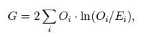
where:
- Oi = the observed frequency in a cell
- Ei = the expected frequency on the null hypothesis
- In denotes the natural logarithm (log to the base e)
G-tests are coming into increasing use, particularly since they were recommended in the 1981 edition of the popular statistics textbook by Sokal and Rohlf. Given the null hypothesis that the observed frequencies result from random sampling from a distribution with the given expected frequencies, the distribution of G is approximately a chi-squared distribution, with the same number of degrees of freedom as in the corresponding chi-squared test.
19.8. Convergence Chart

The convergence chart shows the pattern that a sequence of essentially random samples would settle into. Typically this pattern would be an increasing similarity between samples as the total number of samples grows (see the following chart).
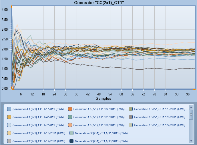
The convergence feature necessitates a query on solution as it uses the returned data to draw the chart. The solution and query must have multiple samples to enable this feature. Please note that some statistics sample collections are NOT counted as valid samples, as shown in the following figure:
For each series in the query results, its convergence output is calculated using the following two formulas:
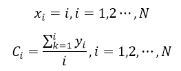
Where N is the total number of data points in the sequence, y is the value in the original query result sequence and C is the corresponding convergence value.
When using convergence chart, a dialog may be shown asking you to select the data series used to build the chart if multiple properties, models or time slices are selected when query the data.
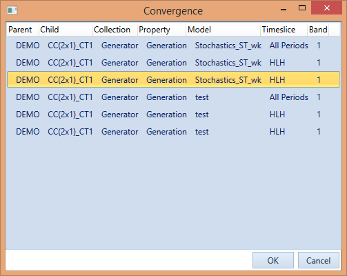
Choose one and click OK to create a new convergence chart.
19.9. Power Flow Impact

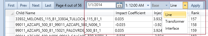
Creates a table showing the injection impact coefficients, injected power flows ranked by absolute value of injection for a selected range of objects (Node, Generator, Zone, Hub, Line, Transformer, Interface and Contingency object), according to the generated injection data and control settings. Please see the "Undocumented Parameters" section for more about Flow Injection.
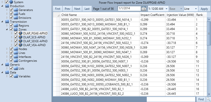
Power Flow Impact Report becomes available after selecting an applicable object from the main tree. In order to use this report, the corresponding output files for power flow injection have to be created for the solution (please refer to Flow Impact section). After selecting date, time and injecting (child) class, the report could be generated by clicking on the "Apply" button.
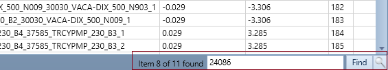
Results are organised by pages, each of which contains 50 records. Users can navigate pages through "First", "Prev", "Next" and "Last" buttons and use text search option (press (magnifying glass) if it is not open) in the right bottom part of the window.
The report can be exported to Microsoft Excel (in CSV format) using the "Excel" button in the ribbon control, under the "Home" menu. Users could export results individually (by selecting one or more rows or cells) or as a whole (by clicking at the upper left corner of the table to select all records). It is also possible to copy and paste results either by right-clicking on the selected records or by using the general shortcuts - Ctrl + C / Ctrl + V.
Also in the "Home" menu in the ribbon control, users could change numeric format used to display the results as well as set the precision of numbers.
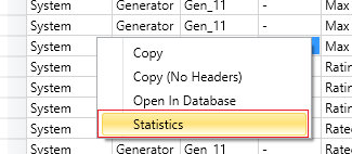
19.10. Solution Statistics

A new statistics page is available since version 7.2, which can be opened by clicking the "Statistics" button under the "Quick Chart" ribbon control, or by choosing "Statistics" in the right-click menu of solution execution results (as shown below).
After choosing statistics, a dialog will display from which you can select which data series to show statistics (Note that this dialog may not open if there is only one series, in which case the statistics page will open directly).
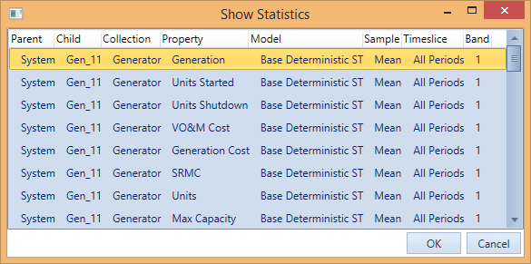
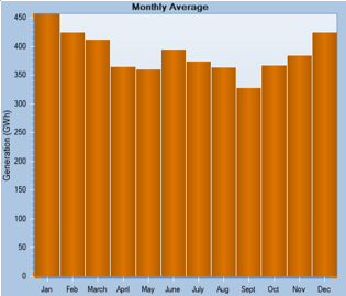
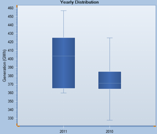
Each series is identified uniquely by seven criteria: parent, child, property, model, sample, time slice and band. Choosing one series and clicking "OK" or double-click on one entry will open the statistics page. This newly added page is similar to the one in data file view, containing density chart [1], average value chart [2] and distribution chart [3] as well as some detailed statistics [4] on the left of the page.
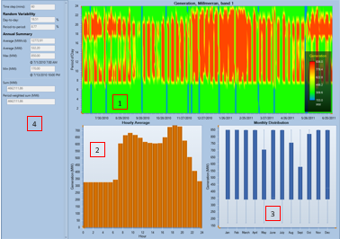
Unlike the one used for visualizing input data file, the statistics page for solution can change accordingly depending on the period type and the selected property. By default, when period type is "Interval" or "Hour", the three charts represent value density across the whole period, hourly average and monthly distribution respectively. In other case, the meaning and representation of the charts may change as described below:
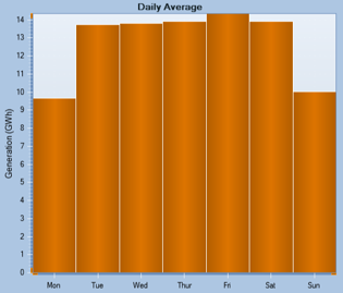
Average Value Chart
Day: average value of each week day
Week/Month: average value of each month
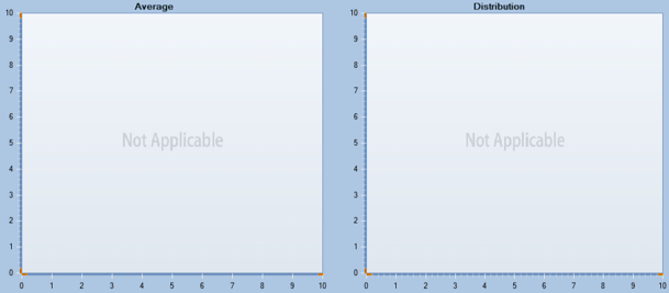
Fiscal year: not applicable in the case
Distribution Chart
Month: yearly distribution
Fiscal year: not applicable in the case
For the "Not Applicable" situations, the chart will be blank and except the words "Not Applicable".
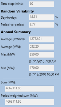
The statistics panel shows some details of the selected series of data, including random variability of data series as well as average, maximum and minimum value of the current series (Note that "Time step" is only available when the period type is "Interval"):
The statistics page can be closed by clicking the pin icon twice, as shown below:
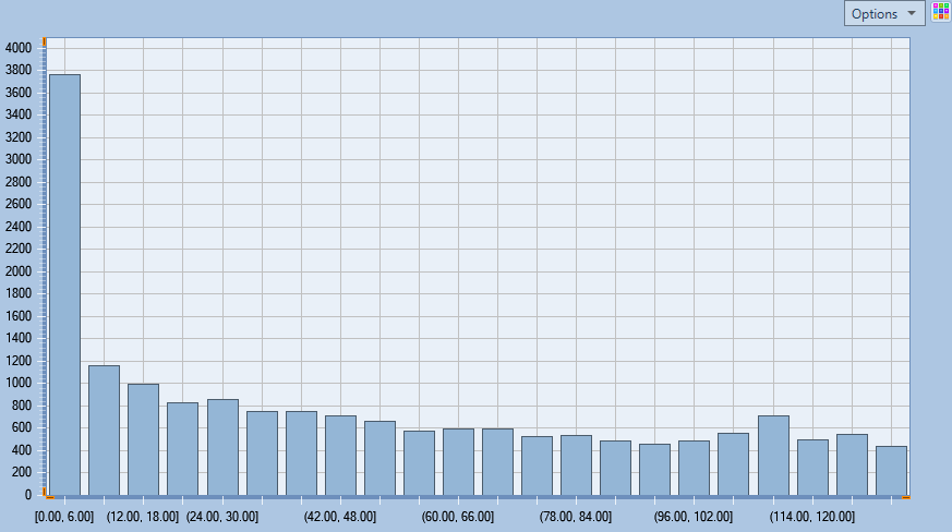
19.11. Histogram

The histogram quick chart allows you to view the numerical distribution of data from a PLEXOS solution. PLEXOS will count the number of results in each bin, where a result is included in a specific bin if the value is greater than the bin's lower limit and equal to or less than the upper limit.
This is further separated by series; each object and property will be in its own series while all series' will share the same bin counts and bin widths. For example, Gen1's Generation will be shown as a separate series (or colour) in the chart to Gen2's Generation but both series will share the bin count and bin ranges to allow them to be shown side by side on the same graph.
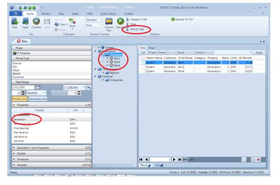
20. Periods Total
Periods total aggregation option performs summing selected data by all periods. The option is available from Home ribbon tab and works in a similar way to Total and Category Total, except that summing is by periods only. In order to query Periods Total, user has to make regular filtering of the left-hand side controls to define what data will be summarized, then press Periods Total button.
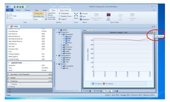
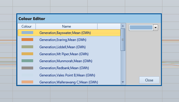
21. Colour Picker
Colour picker button is placed at the upper right corner of a chart (available for all chart types except Bid Stack chart). Pressing the button calls the Colour Picker dialog, where the user can pick a series and assign particular colours.
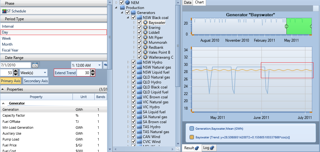
22. Trends
For regular charts (Time Series only), the user can add automatic trend lines. Trend lines are added by selecting the type of trend line from Trend Types combo box. Currently the user can select between linear, polynomial (second order), exponential, power, Fourier, logarithmic and moving average (averaged by 5 points).
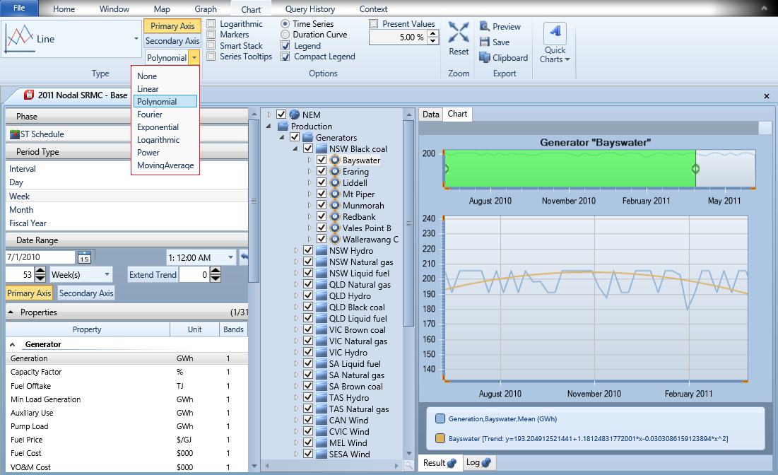
Once the trend type is selected, the user can see trend lines on the chart and trends equations in the legend section. Equation coefficients can be copied to the clipboard by right clicking the trend's label. The data is copied as comma separated values and then pasted by the user. Note that, the trend line legend will display "Trend unavailable" when data is not suitable for calculating certain types of trend lines.
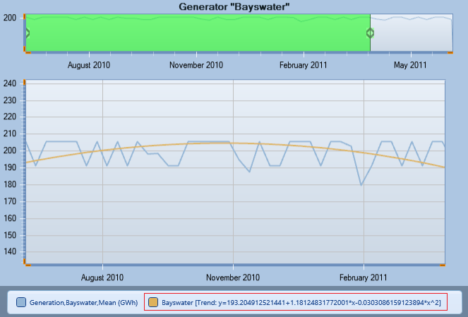
Trends can also be extended by a desired number of periods in Area, Column, Line, Step and Step Area charts. This can be done by setting the number of extending periods and pressing Extend Trend button. On the image below, trend was extended by 30 days as type of period is Day.
Trend lines are not applicable for stacked charts and 3D charts.
And also when a trend type is selected, chart type cannot be changed to stacked or 3D types. In order to select stacked chart, please pick None from Trend Types combo first.

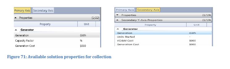
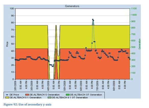
23. Second y-axis
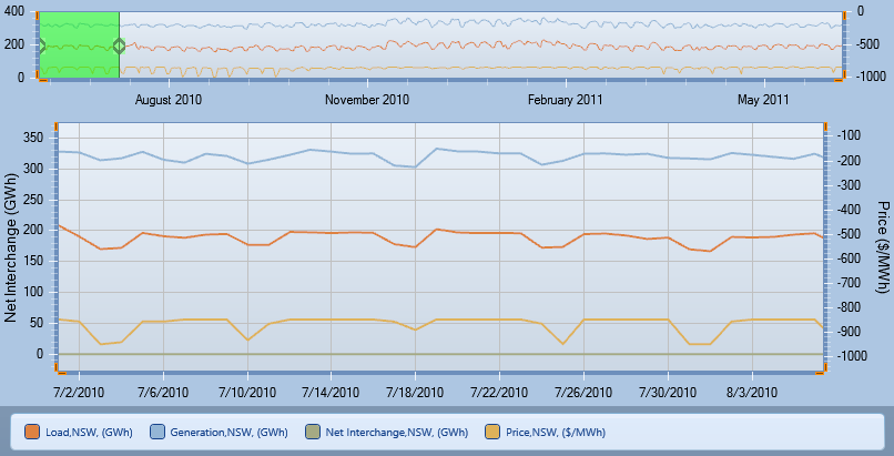
The property list box has two tabs: one for the primary y-axis and one for the secondary y-axis. You can chart any combination of data, even data from different collections on the two available axes. For example you might show the Region Price on the primary y-axis and the generation of several generators on the secondary as in below.
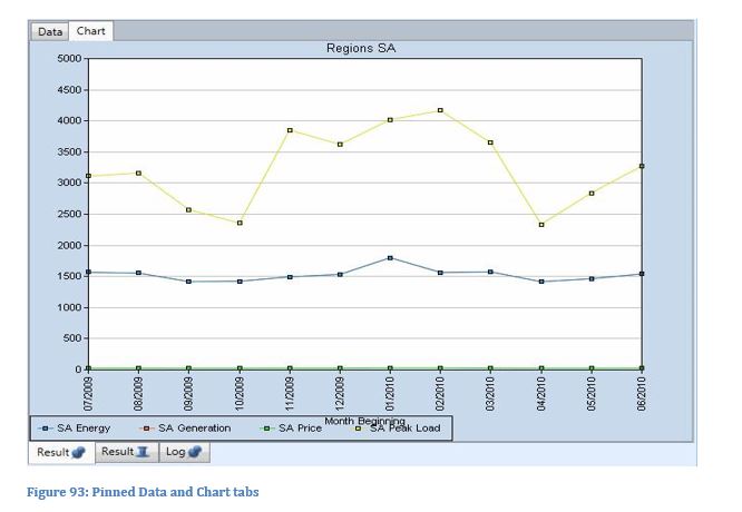
24. Retaining Query Results
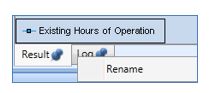
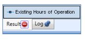
With every new query the Data and Chart viewer are overwritten with the new data. To retain the results of the previous query, you can pin-down the views by simply clicking on the blue pin in the Data and Chart tabs.
You have also the option to rename the tabs by right-clicking on the respective tab. An example is shown below.
Hovering over the pin, the cancel button will appear which allows you to close the tab.
25. Refresh Solution Values
You can safely leave open the solution database while another simulation is running and overwriting the file. When the new solution database is written, PLEXOS will notify that the currently open file is out-of-date and give you the following options:
- Open the updated solution database in a new file tab; or
- Refresh all currently open Result tabs with the updated data.
Choosing the refresh option is convenient in that it will rerun all queries with the updated solution data, but opening a new tab is useful if you want to compare the old and new results.
26. Repeating Previous Queries
On the tabs of the ribbon menu there is a Query History tab. Clicking this opens a window that records all the queries you have recently executed.
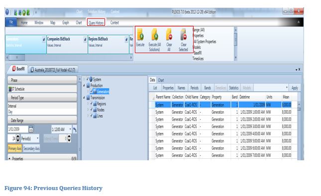
This window can be used to pin, execute all any query you have done in the past on any solution window. You can pin Solution Run and Run all saved Solution run from the Query History window.
27. Saving a Solution View
The Window tab also includes the Solution View group of controls:
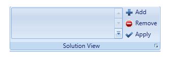
This acts like a gallery where you can save Solution Views, being a set of Result tabs containing grids and charts so that you can reload that view with another Solution File either in the same session or at any time in a future session. This feature allows you to create and save Solution Views like "templates".
To use the feature:
- Execute the set of Results you want to keep as a Solution View template. For example you might make a chart of Region Price on one Result tab, and an Area Chart of Generator Generation on another tab.
- Click Add to add the view to the gallery.
- Give the view a name and optional description to remind of what the view is about.
The named Solution View will appear in the gallery in the current and future sessions until you remove it.
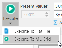
28. Machine Learning Grid
PLEXOS can consume Machine Learning Models generated with Microsoft Visual Studio, or from PLEXOS itself. The Machine Learning Grid (ML Grid) allows you to generate a Machine Learning Model from Solution results.
You can only have one ML Grid for a Solution and each query targetted at the ML Grid is appended to the data for the ML input. To create a new grid or append a query result to the current ML Grid, execute a query using the "Execute to ML Grid" Ribbon item.
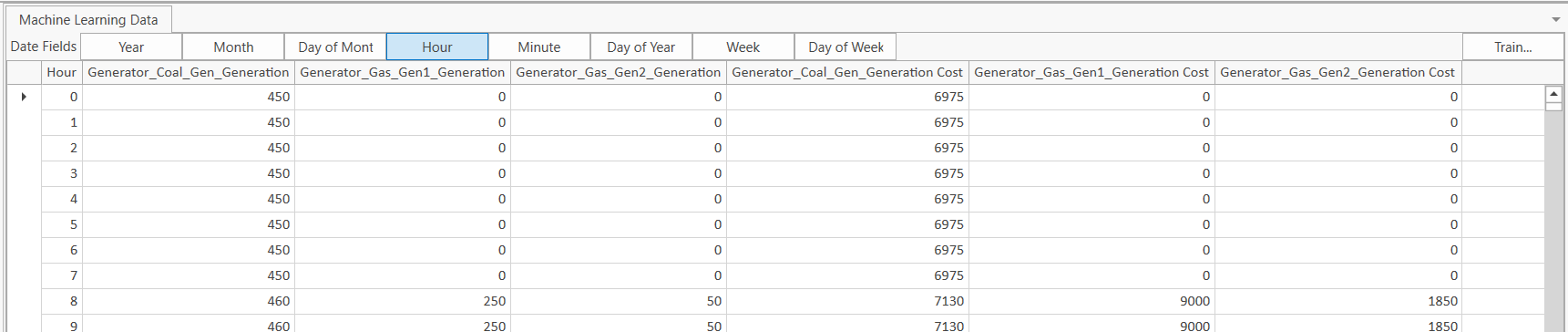
By executing multiple queries you can build up a series of columns in the grid. You can also add columns to represent parts of the date using one or more of the Date Field options. Since only numeric data is usable, the date itself cannot be used. Right-click a grid column header and select Column Chooser to remove (or add back) columns from the grid.
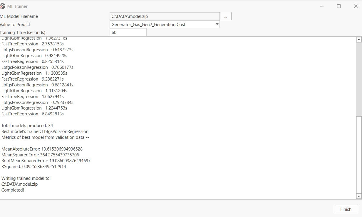
Clicking the Train button will bring up the following dialog in which you can select a destination file and a value to predict. The Traing Time is a maximum time. Training may complete faster than this.
To understand how to use a Machine Learning Model in a PLEXOS Simulation, see Machine Learning Models
29. Solution Comparison
Two data queries (either on the same solution or on two different solutions) can be compared side by side by using solution comparison tool which resides in the Window tab in ribbon control:
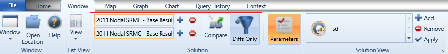
Below is the general procedures to use this feature:
- On one solution file, preform the query on the properties you are interested in.
- Click the top + button to add the result into comparison.
- Choose another solution or keep using the previous one, and than either a) open the history window and the execute command from that window to repeat the query you last performed or b) run another query with what every parameters you want.
- Click the bottom + button to add this second result into comparison.
- Click to compare button to perform comparison.
After the comparison finished, a solution comparison windows will open (as shown in the following picture) in which you can see the differences between two queries:
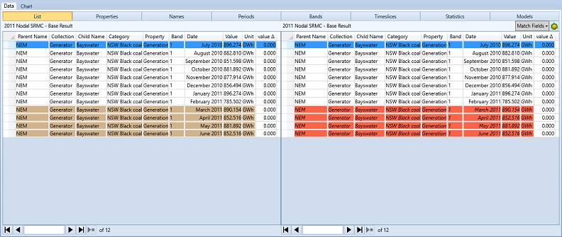
There is also a solution comparison chart for this feature and you can find it next to the default data tab in solution comparison window.
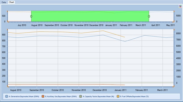
The solution comparison chart is much similar to the general solution chart (please refer to section 13 for more information). You can use the common charting settings in the same way as what you would do through the chart tab in ribbon control.
However please note that, because of the nature of solution result comparison and the needs for flexibility, Radar and Radar Filled chart types as well as the trend line option are unavailable here. In addition, as the query results using the newly added period type "Block" are block id-based rather that time-based, the "Block" query result can only be compared with that of another "Block" query.